WorkCase study
Bamerhav Architects
Bamerhav is an architecture studio whose work includes synagogues, public buildings and housing. I designed its identity, from the first sketches to the brand book and the files handed over, then designed its site and built it in Framer with a CMS.
bamerhav.co.il (opens in a new tab)- Role
- Brand identity · Web design · Framer build
- Timeline
- Brand January to May 2025 · Site March to September 2025
- Stack
- Figma, Framer, Illustrator
- Status
- Live
Problem
The studio wanted the presence of a large office without losing the memory of the brand it already had. That set the brief for both halves of the work: an identity, from three directions to a brand book and a handover package, and a site, built in Framer with a CMS, that puts the projects first.
My role
- Brand identity
- Web design
- Framer build
The brand
Where it started
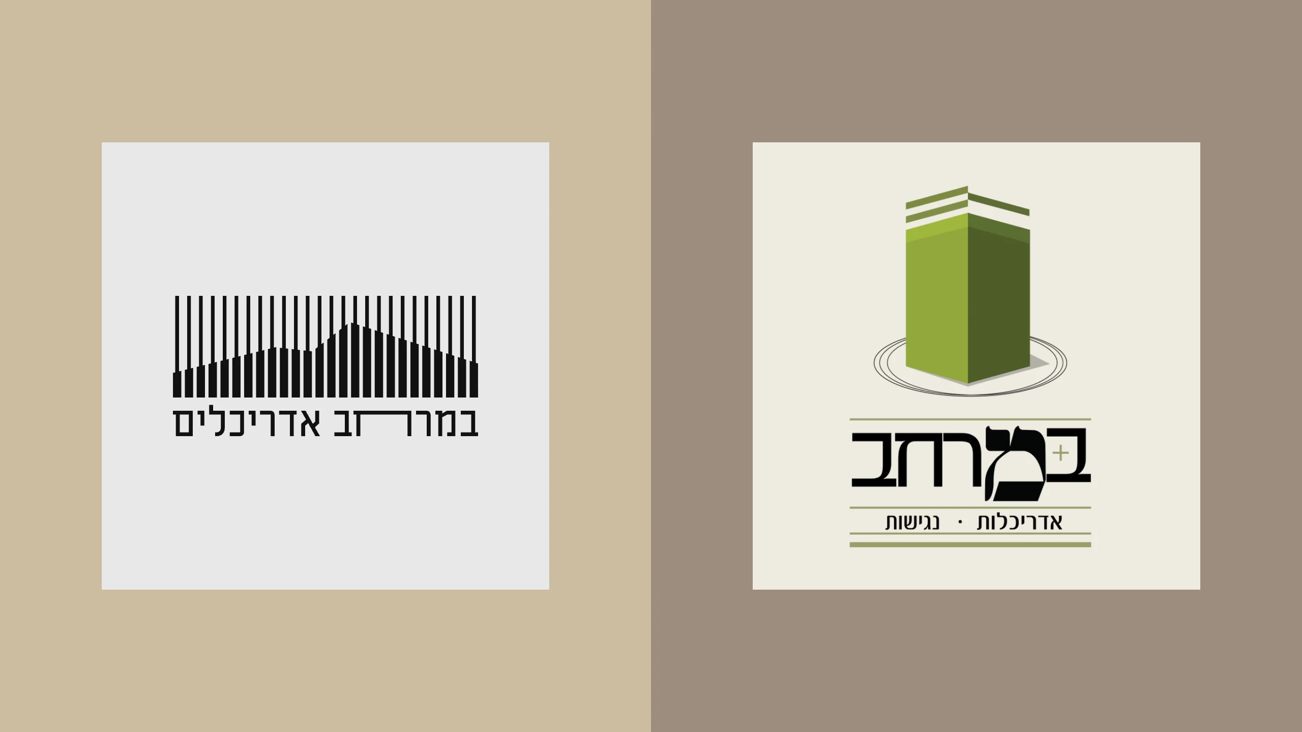
במרחב means “in the space”. The studio’s work includes synagogues, public buildings and housing, and it already had a logo: a green block on an ellipse over a serif במרחב. It wanted the presence of a large office without losing the memory of that brand, and that balance set the brief for everything after it.
Three directions
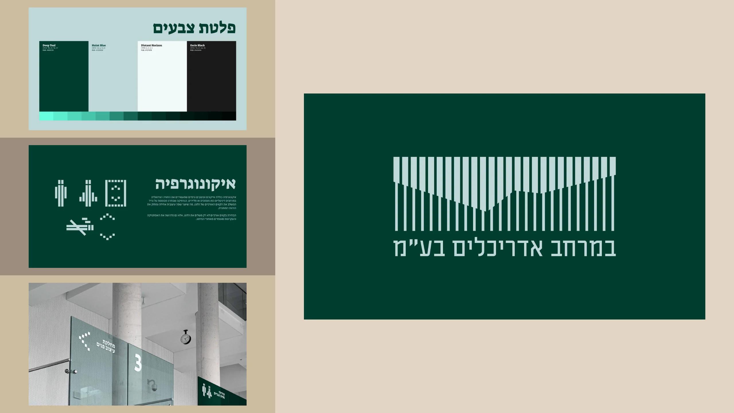
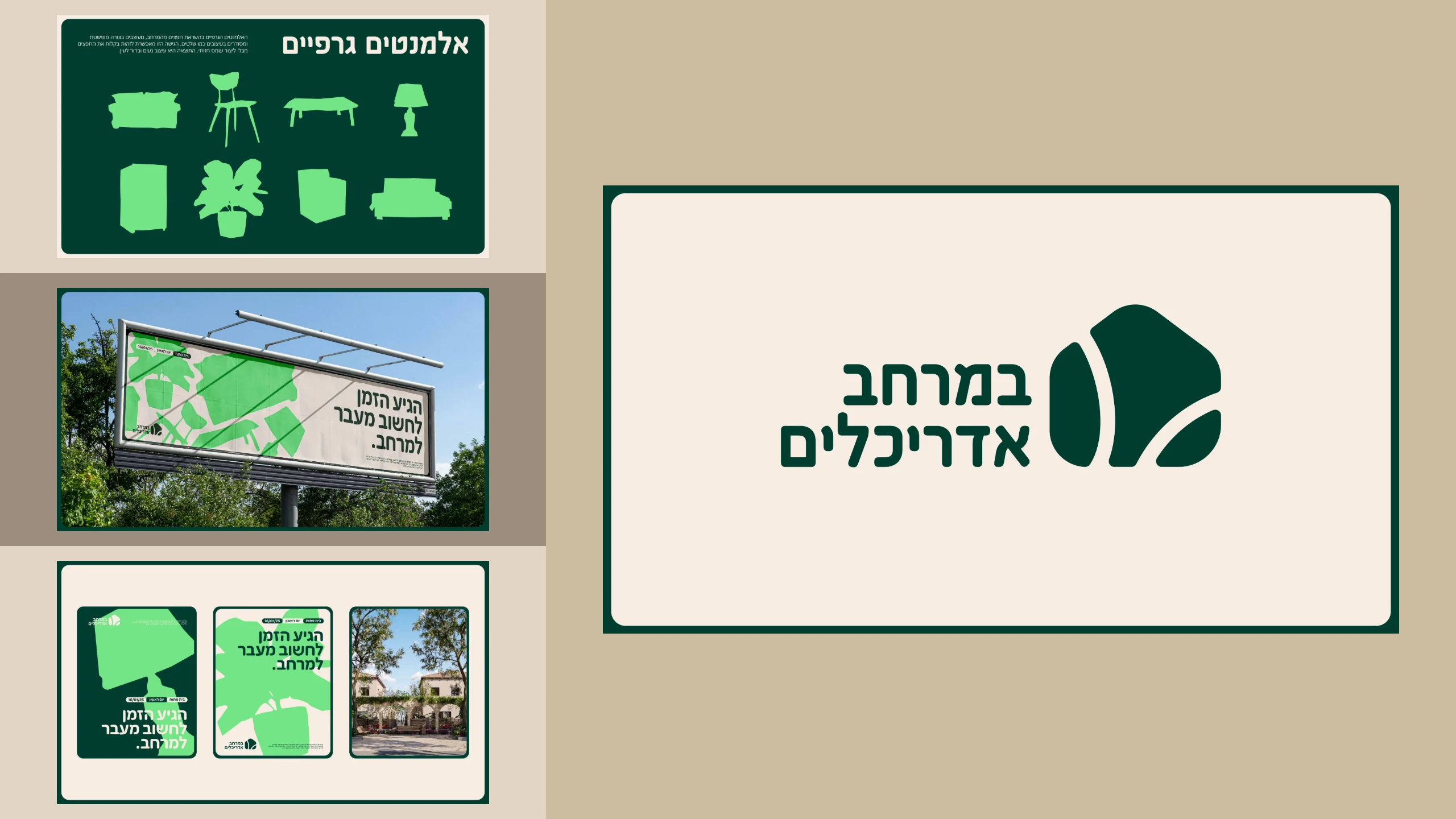
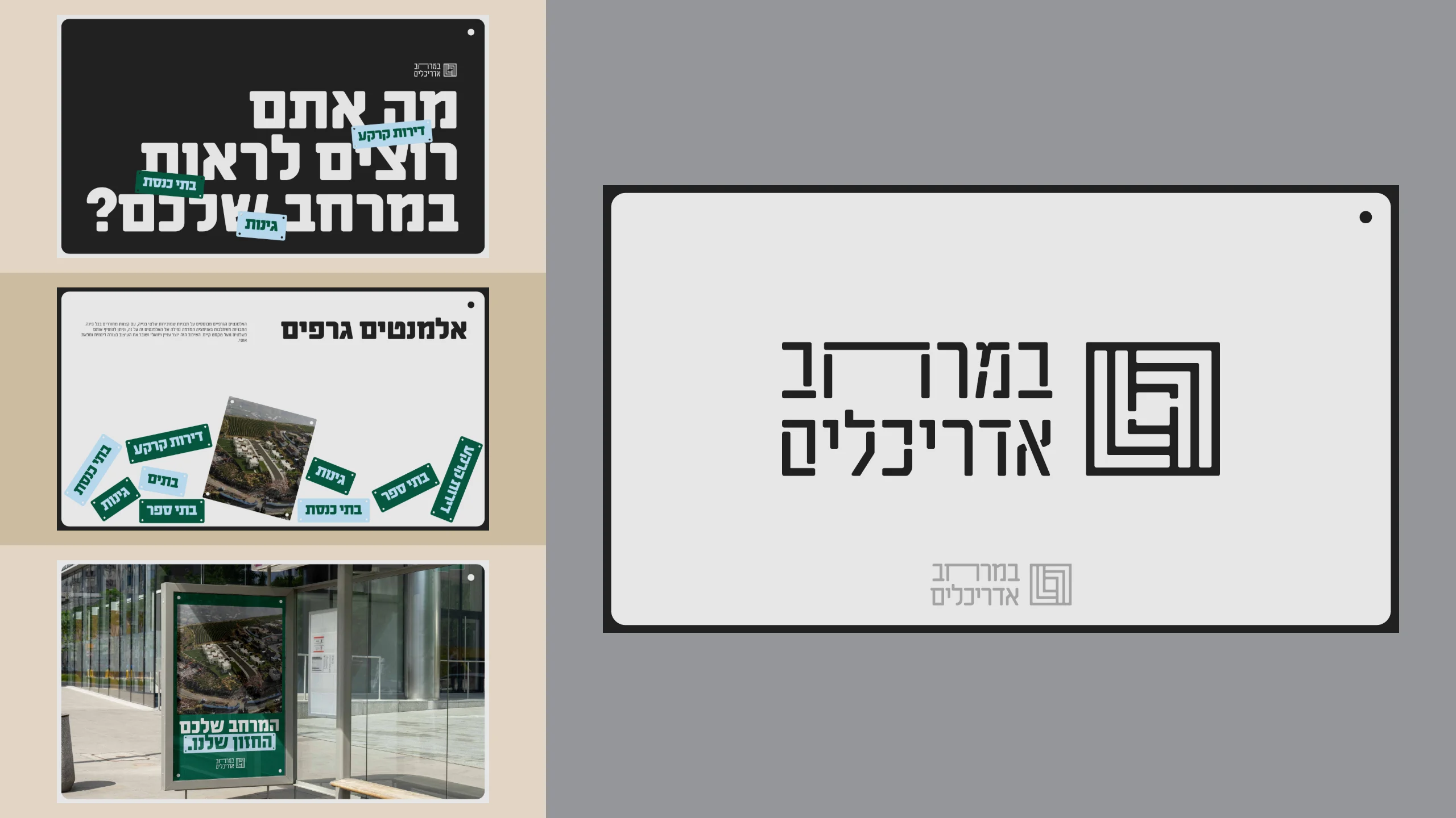
After many sketches, three directions went to the studio, each a small, complete world: a mark, type, color, graphic elements and the logo at work on posters, signs and billboards. The first is built from the long vertical lines of its mark, with icons drawn on a grid of the same lines. The second is soft and friendly, with furniture abstracted into signs. The third speaks in one heavy, wide typeface, its labels cut like construction signs.
Three directions
From sketch to rule
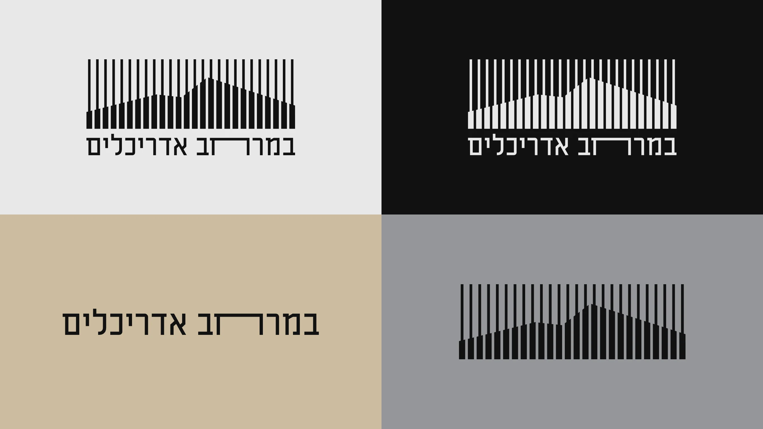
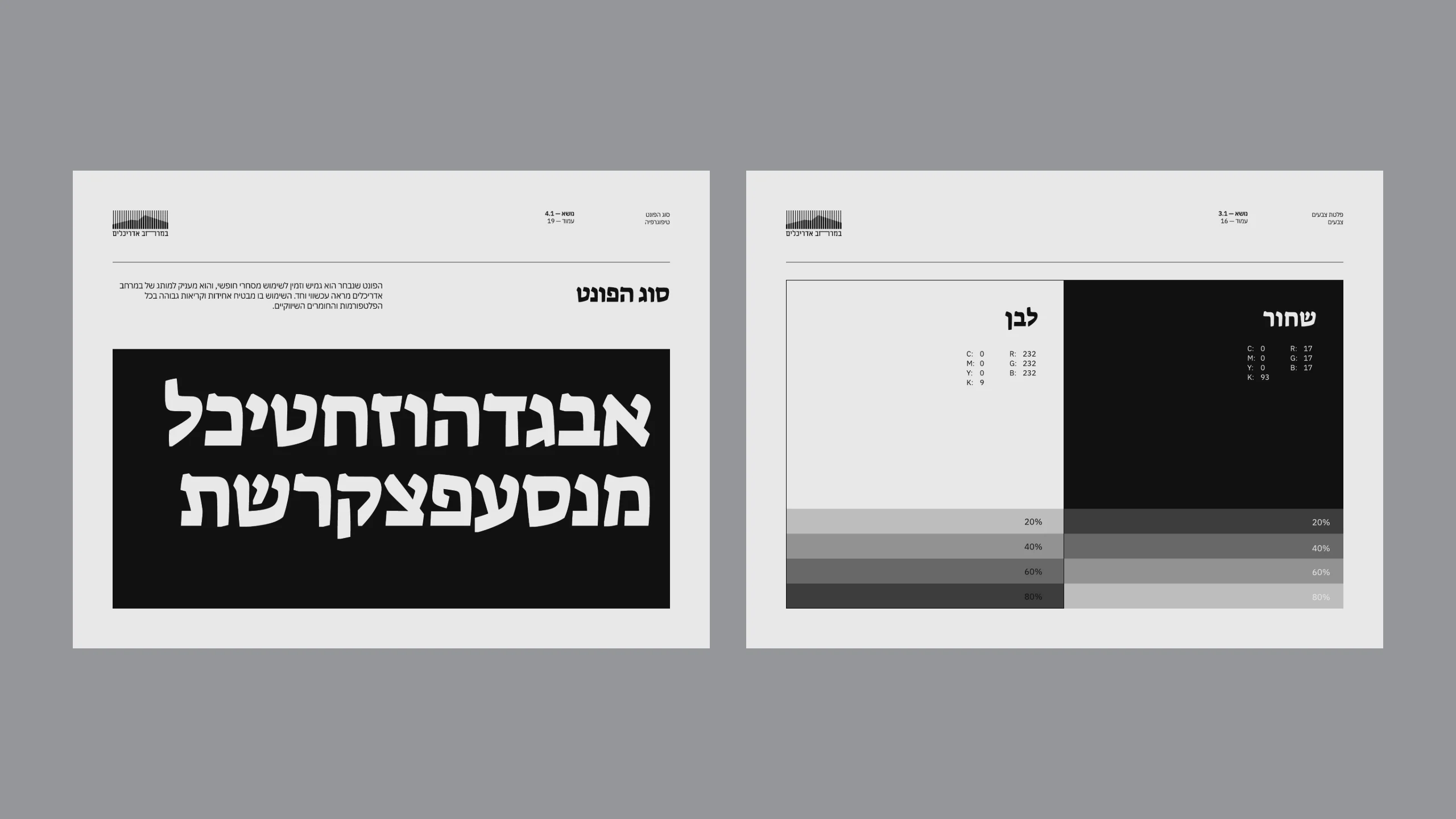
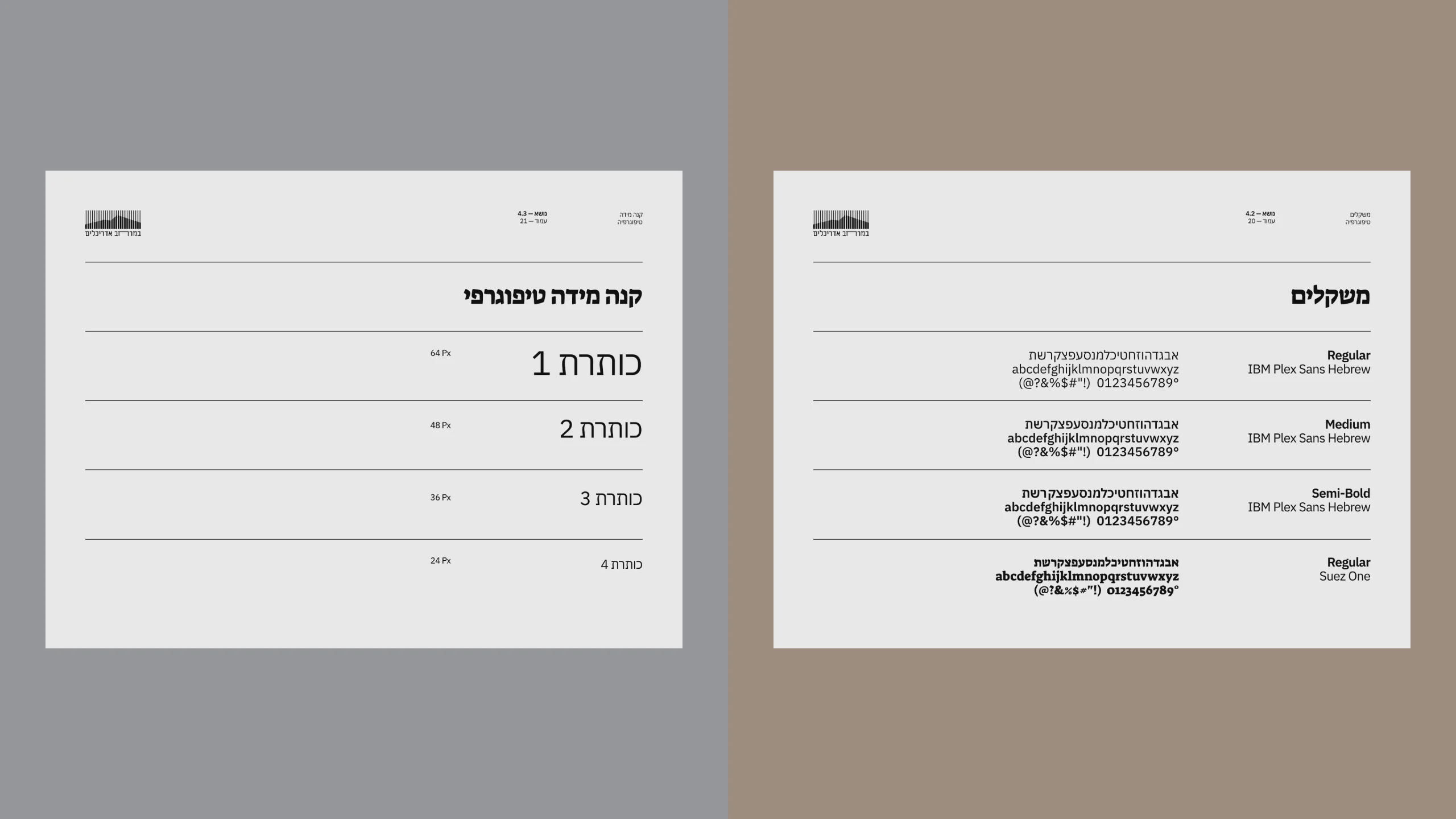
The studio chose round one: its story represented the studio better, and it showed it as a more serious office. Its mark carried through, twenty-six upright bars of changing height over the name. No bar stands for anything alone; together they draw a mountain ridge, for a studio in the hills of Judea and Samaria, where most of its clients are. Its two typefaces carried through too: Suez One for display, chosen for a nostalgic note that recalls the מ of the old logo, and IBM Plex Sans Hebrew for text.
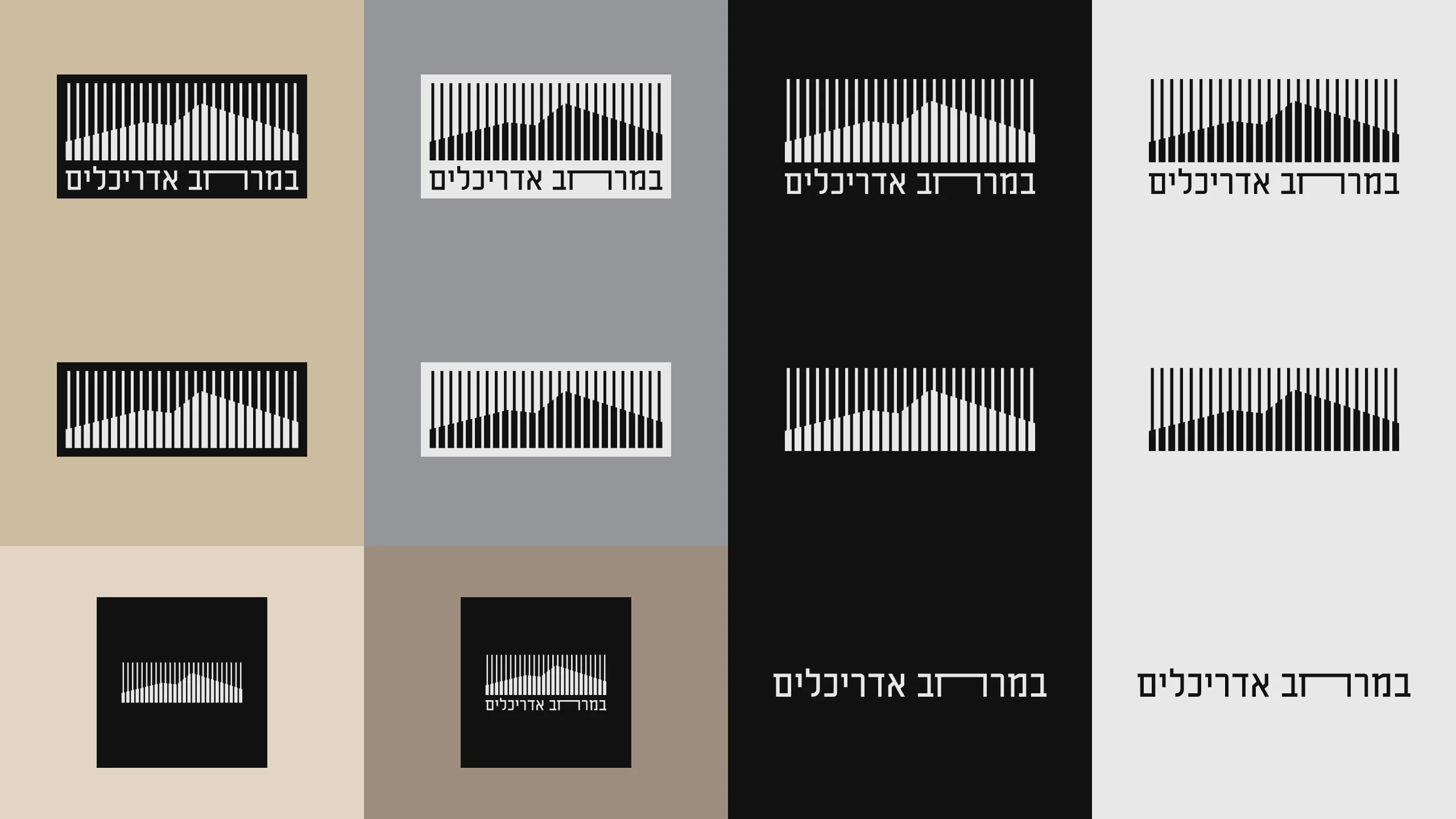
The deep teal did not. The studio found black and a light gray more serious and more its own, so the identity went out in #111 and #e8e8e8, with their tints. The logo comes as a full logo, the mark alone and the logotype alone, in black and in white, and it has an animation of its own that fills the bars with black one at a time.
One book for the system
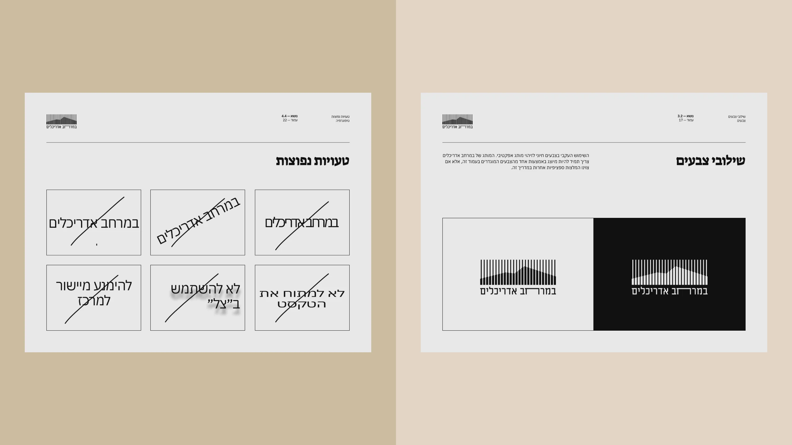
The brand book holds it all: the two colors and their tints from 20 to 80 percent, IBM Plex Sans Hebrew in three weights with Suez One for display, a type scale, the logo on light and on dark, its clear space and minimum sizes, and the common mistakes, crossed out.
From the brand book
Handing it over
The studio got one package with a short guide: what each folder holds, which free fonts to install, and which file format to use where. Among its files are the brand book and the logo in twelve versions, each as SVG, PNG and JPG.
The site
The work comes first
I designed the studio’s site and built it in Framer with a CMS, starting from the hero, with everything set on grids, and later recorded a guide to the CMS for the studio. The home page opens on one line, רואים חוכמה במרחב. (“Seeing wisdom in the space.”), whose middle word changes: wisdom, nature, you.
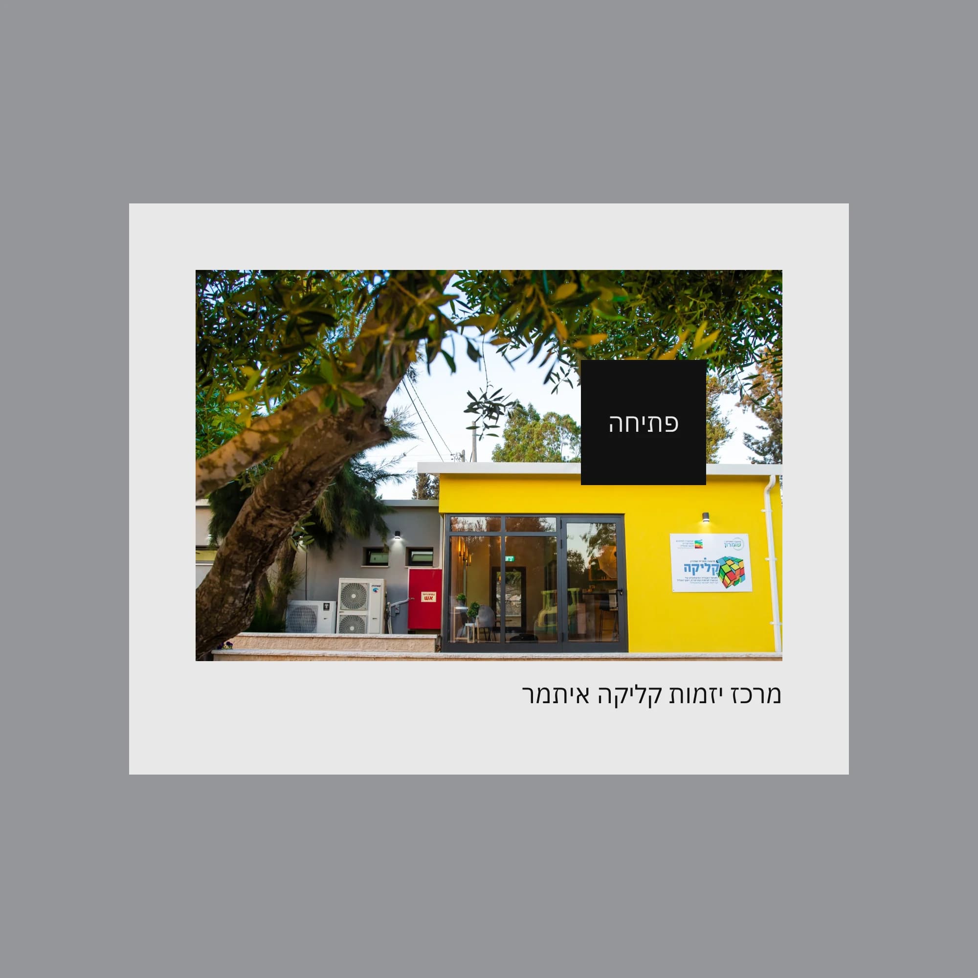
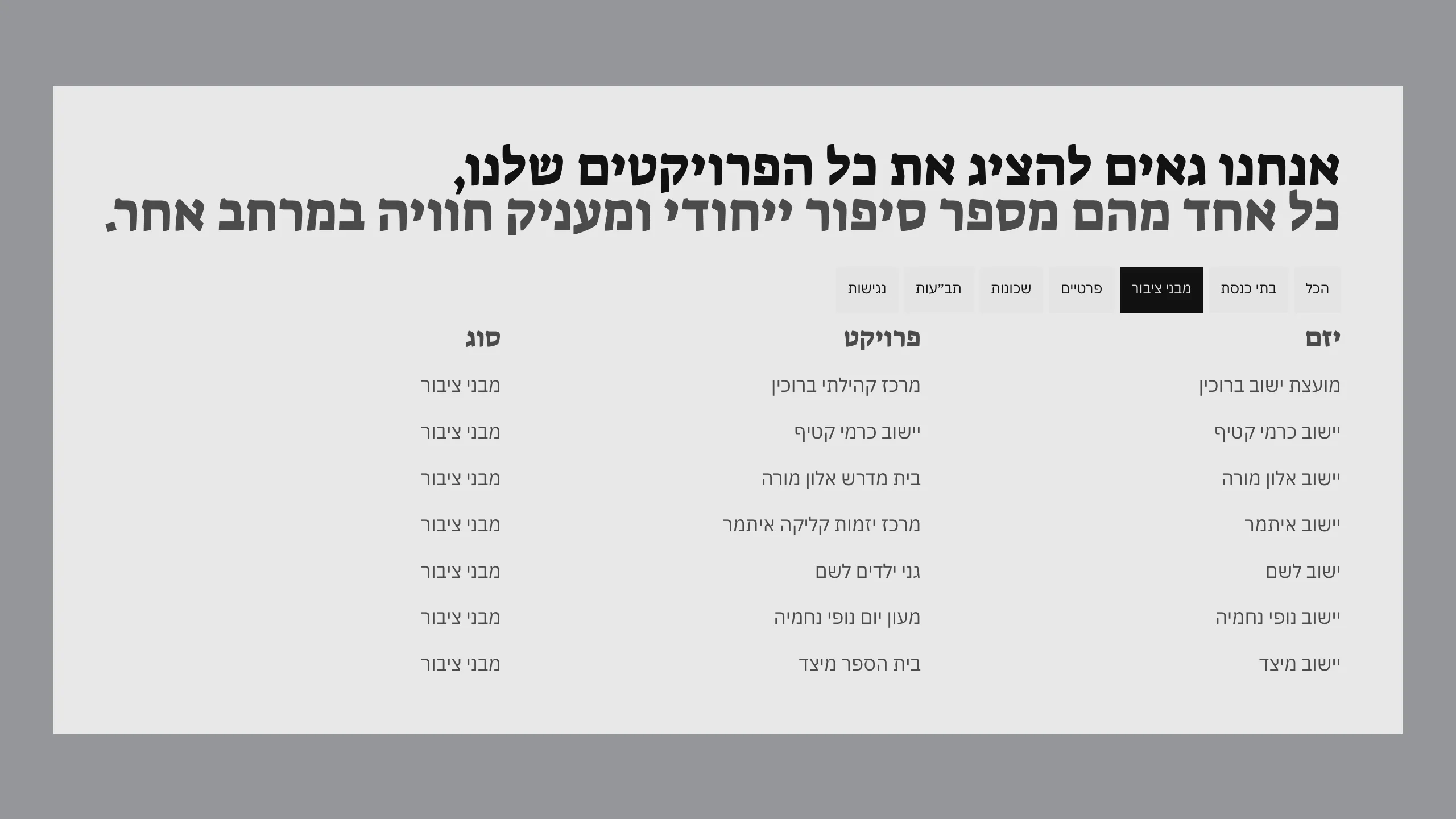
Then the projects. A table of developers and projects answers the pointer row by row, over a project card the cursor becomes a disc that reads פתיחה (“Open”), the projects page filters by kind, and each project has a page of its own.
A drawing grid
Like the software architects draw in, the site carries a grid with X and Y axes that follows the cursor and reads out where it is. One button hides it.
On a phone
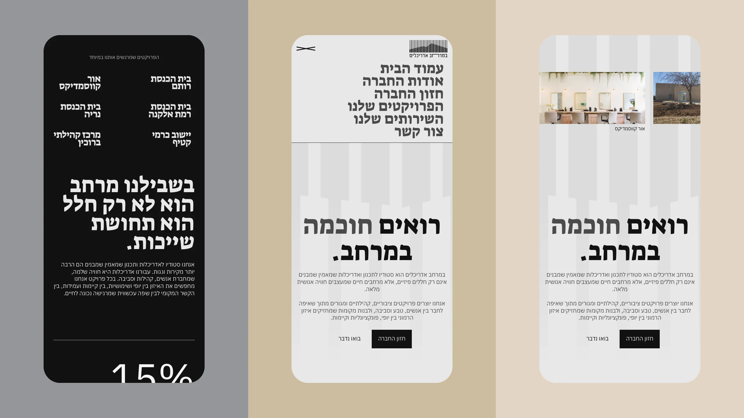
The same site on a phone: the home page, the menu open, and the black section further down.
Built with
- Figma
- Framer
- Illustrator
Outcome
The site is live at bamerhav.co.il.
Credits
- Jonathan Rashi
- Brand identity · Web design · Framer build
About the pictures
Nothing here is redrawn. The brand boards place the studio’s own files as delivered, the logo files and pages of the brand book and the sketch decks at their own proportions, on flat fields of stone, concrete and sand chosen for this case study. The site’s boards and films are bamerhav.co.il’s own pages, taken signed out on October 24, 2026 and laid out again by a browser, with nothing recolored or retouched. In the films the states are the site’s own; the timing, the pointer and the transitions are edited, and where the site fades, the films slide. The logo animation is rebuilt from the delivered file at 60 frames a second, and only its return to gray is added. The footer’s contact details and any sketch with a person in it are left out.