WorkCase study
Play
A brand identity for an Israeli music-app concept. I designed a system of colorful shapes, Hebrew typography and motion, then applied it to artist artwork, outdoor campaigns and app screens.
- Role
- Brand identity · App UI · Motion design
- Timeline
- Published July 2023
- Stack
- Illustrator, After Effects, Photoshop
- Status
- Design concept
Problem
How could a music app make exploring Israeli music feel inviting to a younger audience? I built Play’s identity around “music as a journey”, with a visual language that could carry different artists and genres across an app and its campaign.
My role
- Brand identity
- App UI
- Motion design
The identity
Music as a journey
Play is a music-app concept for young Israeli listeners. I wanted the identity to make room for discovering local music, from familiar names to artists someone hasn’t heard before.
The idea was “music as a journey”. I translated it into a set of bright colors and simple shapes that could move between the app, artist artwork and outdoor advertising.
One set of shapes, many combinations
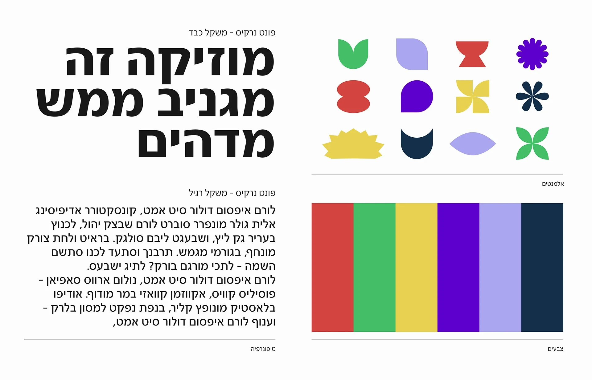
The system pairs twelve geometric shapes with six colors: red, green, yellow, purple, lavender and navy. Flowers, petals, rounded forms and sharp bursts give the compositions different rhythms.
I used Narkis in heavy and regular weights. Large, heavy Hebrew headlines hold the posters together, while the regular weight carries supporting text. Color and shape can change around that consistent type.
A mark that works in motion
The logo pairs the Hebrew name פליי (“Play”) with a compact symbol made from two rounded forms. The symbol also stands on its own as the app icon.
The animations show the wordmark’s construction and carry the color changes into the mark. The same small set of parts gives the identity something to do when it moves.
In use
All the singers in one place
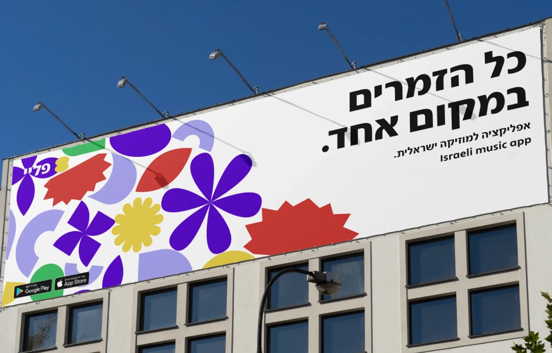
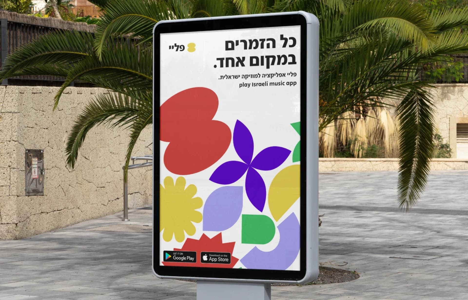
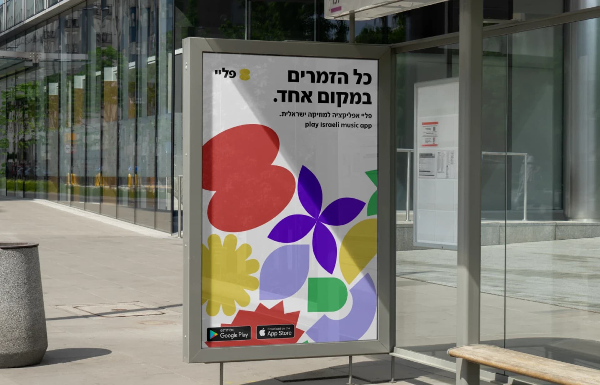
The campaign headline is כל הזמרים במקום אחד. (“All the singers in one place.”). One version lets the shapes fill the poster; another puts an artist’s portrait and name at the center.
I applied both approaches to building billboards, street displays and bus shelters. The mockups show how the same identity changes scale and composition across those formats.
Campaign applications
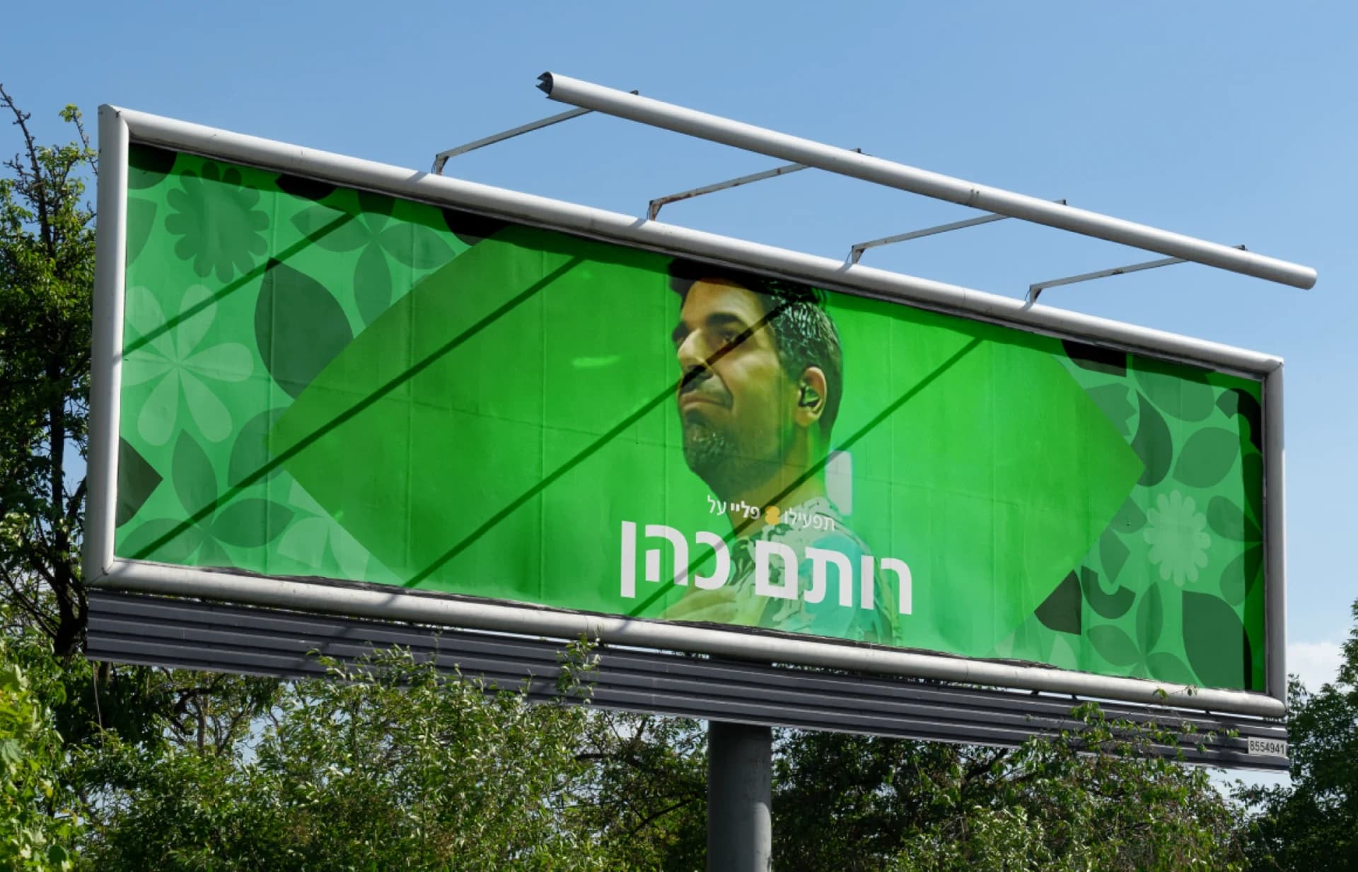
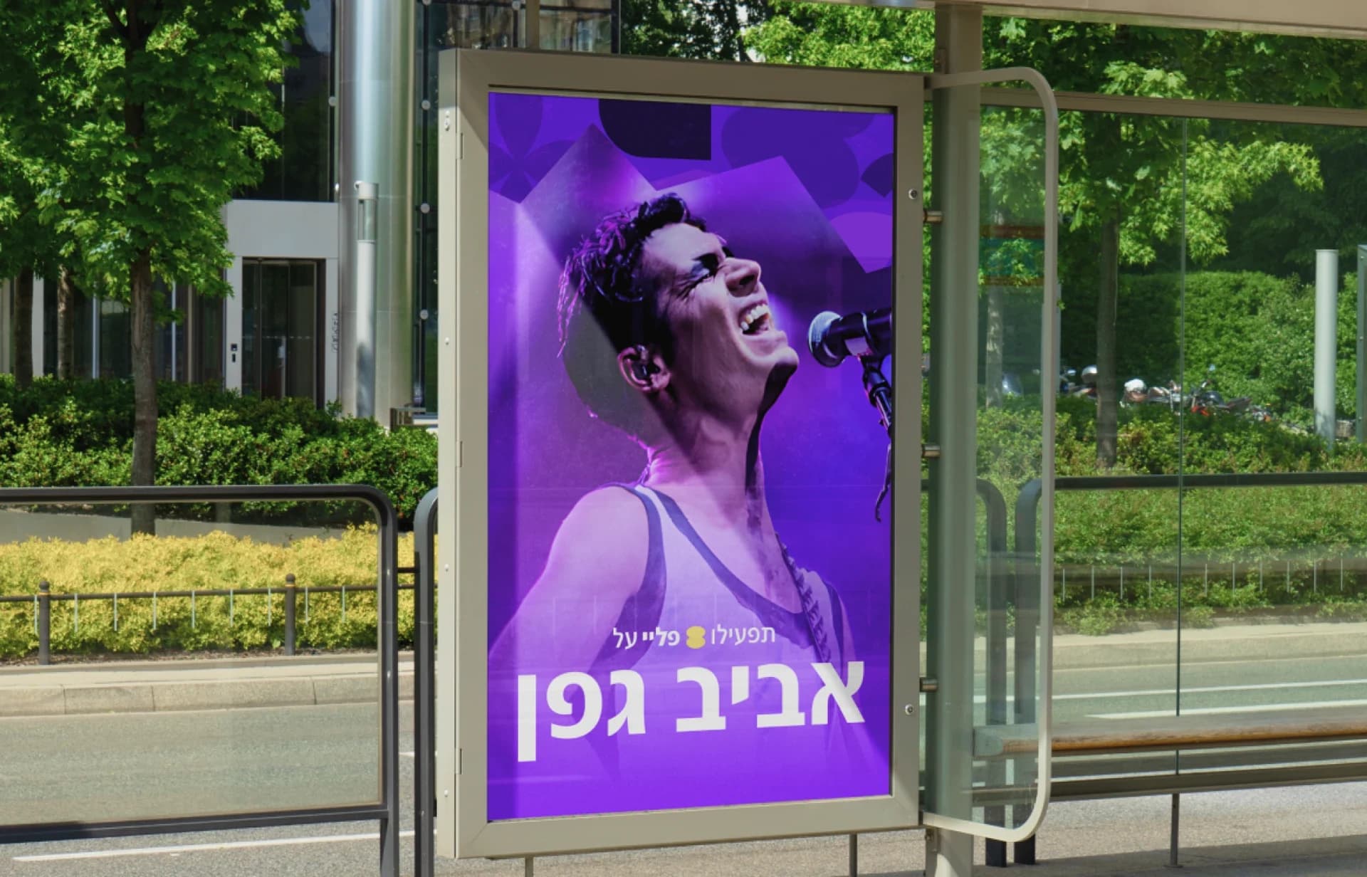
Giving each artist their own space
Artist portraits sit inside and alongside the graphic shapes. Each composition uses its own color and arrangement, with large Hebrew names keeping the artists recognizable.
The vertical artwork and animated cards use the same ingredients at a smaller scale, connecting the campaign to the music itself.
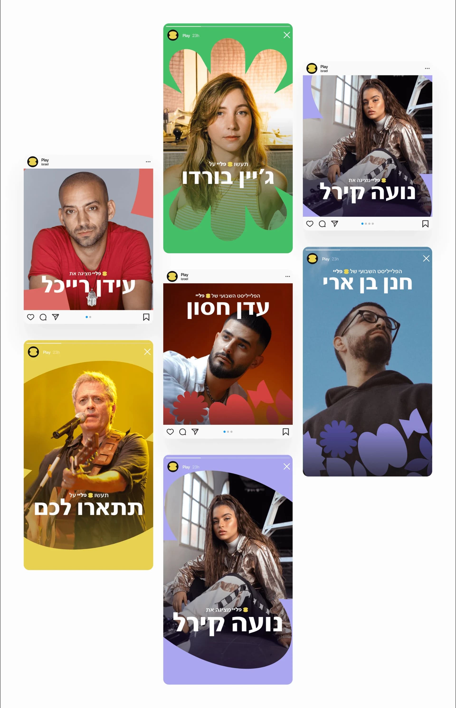
Bringing the identity into the app
The app concept uses a light background and right-to-left Hebrew layouts. The welcome screen introduces the shapes and colors; the home screen gives more space to artists, album covers and playlists.
The player keeps the album artwork prominent, with track information and playback controls underneath. These screens show how the brand extends into a listening interface.
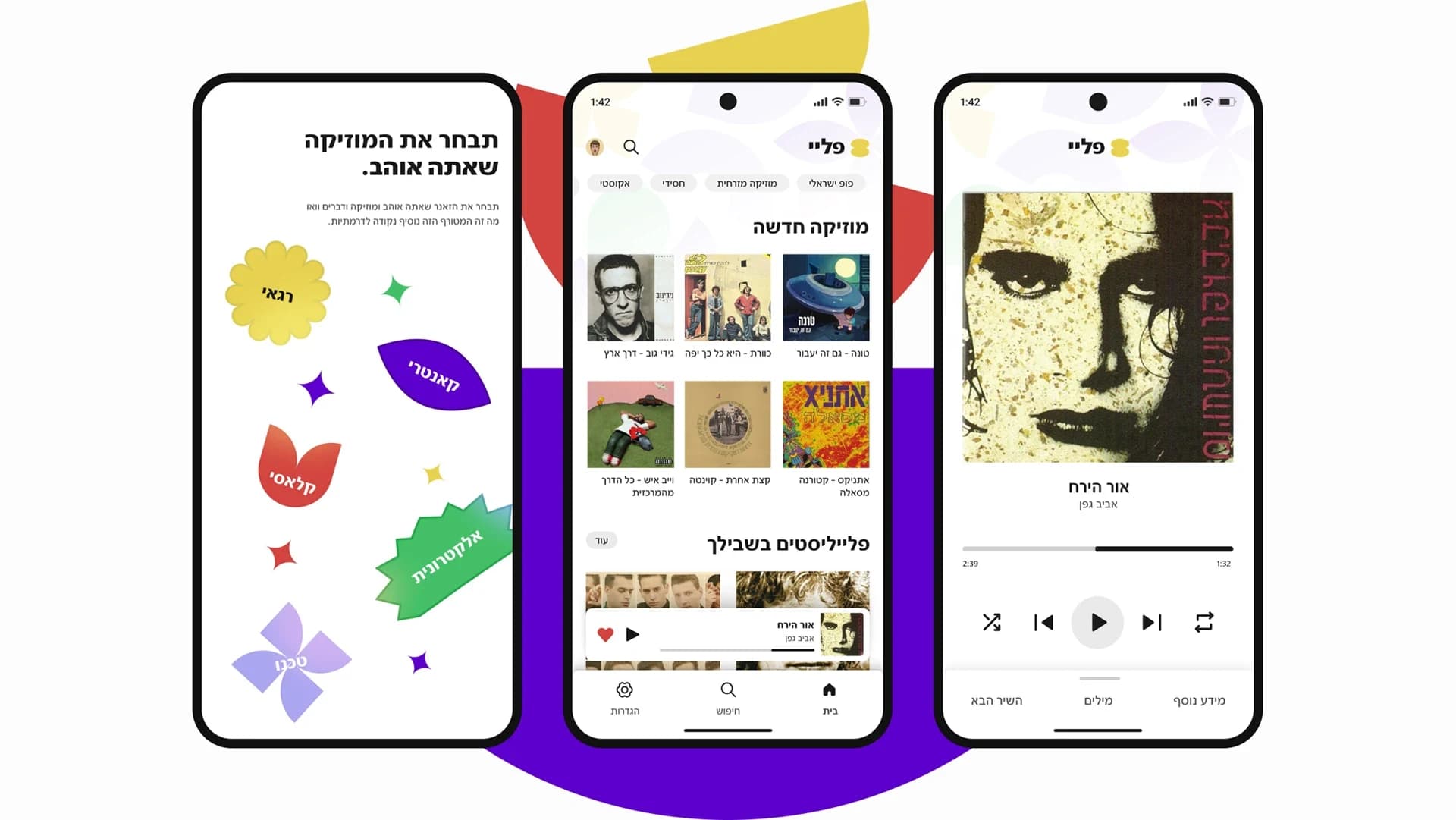
Built with
- Illustrator
- After Effects
- Photoshop
Outcome
The concept brings together a visual identity, logo animations, artist artwork, outdoor campaign mockups and app screens.
Credits
- Jonathan Rashi
- Brand identity · App UI · Motion design
About the pictures
The images and five animations are from my original Behance presentation. The campaign and phone images are design mockups. The images retain their original artwork and proportions; the videos are served from this site, without sound, and pause with the site’s motion setting.